C A S E S T U D Y 2 0 2 1
Refining the checkout experience
M Y R O L E
I lead the design for the checkout flow (payment methods, order review and, order confirmation) through end to end process: discovery, design, testing, support through launch
A B O U T T H E P R O J E C T
In an effort to create an omni-channel experience, Walmart decided to merge its two separate apps, its flagship Walmart app (the blue one) and the Walmart Grocery app (the orange one) creating a seamless shopping experience for the customer.
T H E P R O B L E M
As part of the ongoing effort to create an omni channel experience we had an opportunity to address some previously recorded UX and usability issues.
The Order Review screen had a 58% drop off rate - what's causing it and what did we do to mitigate this drop?
Hypothesis:
Average basket size of a grocery customer is about 90-100 items which made the “order review screen” screen extra long and increased cognitive load. Customers reach the “order review screen” expecting to quickly place their order, they may be overwhelmed by the amount of information, calls to actions and scrolling they need to consider prior to placing their order. This resulted in customers lacking the clarity that they were seeking when reviewing their order and many chose simply to not place their order.
R E S E A R C H
An extensive study on our competitors helped me understand the problems in our current experience. I identified how our competitors were approaching the online order review experience. Some of the competitors I looked at were Target, Instacart, Good Eggs, J C Penny.
Observations:
Highly scannable screen.
Clear and bold primary call to action- “Place my order”.
Savings via discount codes and gift cards highlighted.
Quick payment possible via “Apple Pay”
D E S I G N G O A L
To make “order review” screen more scannable
Reduce the cognitive load so that customers can complete the task of placing the order easily and quickly
Redesign the UI based on the “Living design system”
U S E R J O U R N E Y
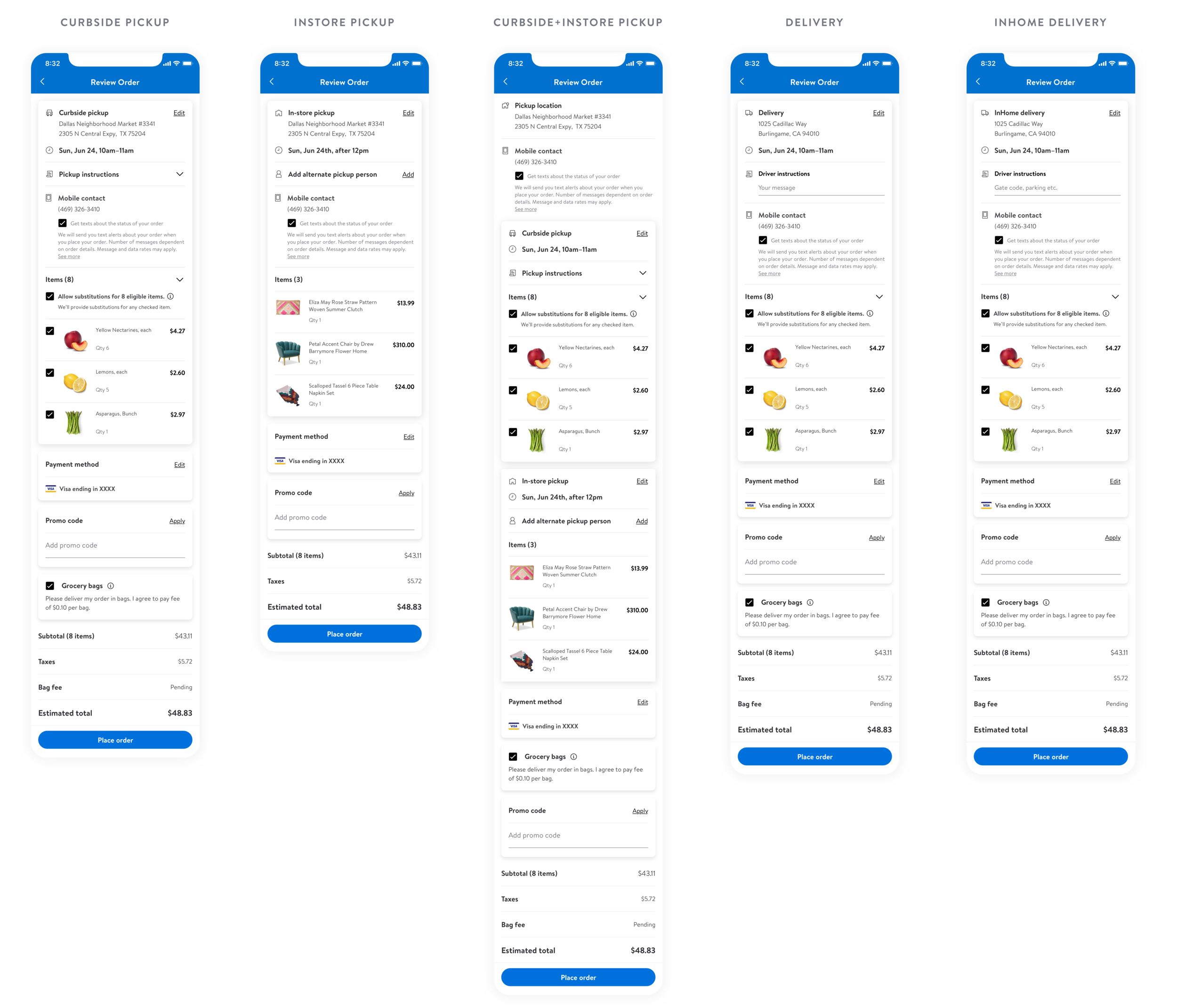
Before starting with screens I laid out the some high level checkout flows. Walmart provides its customer with several fulfillment options and combinations, In order to understand that better I laid out form flows detailing out the fulfillment section.
High level checkout flow:
Fulfillments:
E X P L O R A T I O N S
Initially, I explored different layouts and interactions. As part of my process, I detailed out every variation and weighed the pros and cons of each. Each option also went through a UX, PM, and engineering review. Although, option 3 was on point with the goal that we were trying to achieve but was not technically feasible in the time that we had. We finally decided to go with Option 1 with a few modifications.
I T E R A T I O N S
Explorations on the “items section” and variations for the expand and collapse functionality.
D E F I N E A N D D E S I G N
R E F I N E A N D S H I P
Usecase 1: Support displaying different fulfillment types and combinations.
Usecase 2: Support changing store location
Usecase 3: Alternate pickup person for instore and split orders
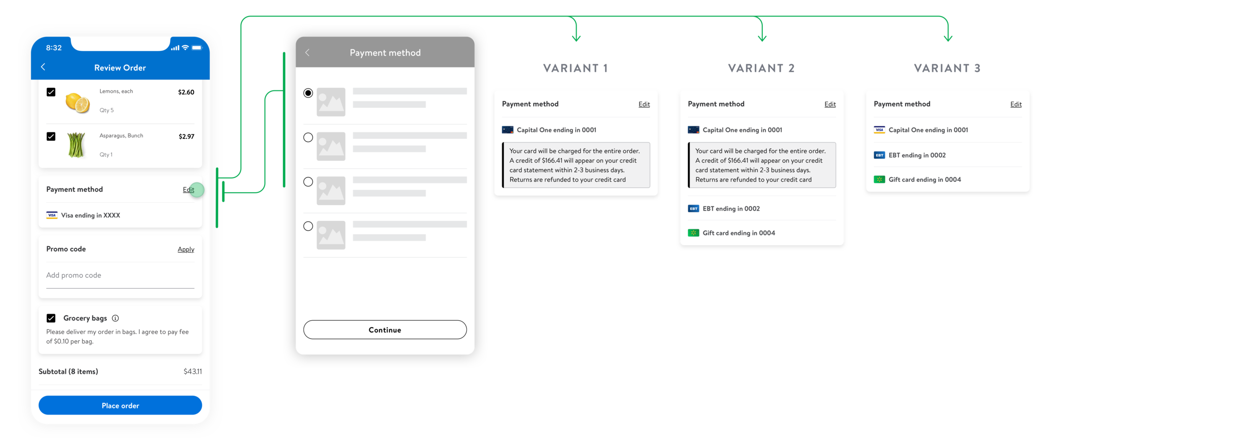
Usecase 4: Support for showing multiple tender payments
A D A C O M P L I A N C E
At Walmart we make sure that all the components in the final designs are ADA compliant. As part of the process we also document these components which are then referenced by the engineering team.
L E A R N I N G S
Advocate for the end user. Make decisions based on our customer’s and associate’s needs and behaviors, and work to express and champion those throughout the organization.
Remove friction at every chance. Help our customers and associates discover and get what they need in the most efficient and effective way possible.
I had to work under very strict technical constraints, but still fight for what I believe is essential to having a good user experience.
Don’t overpromise and underdeliver


